
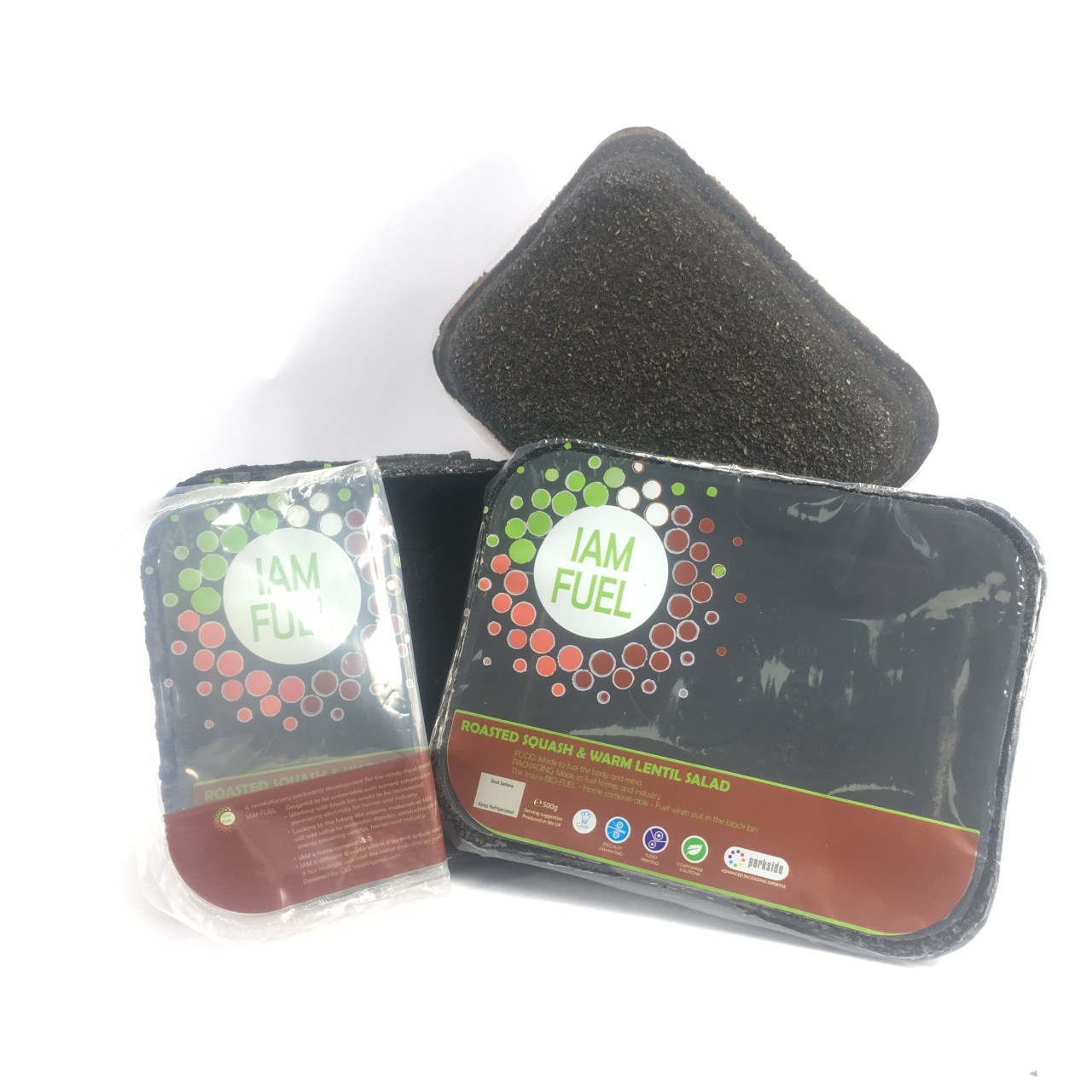
Bike ride to packaging in one easy rotation.
I’d been pondering how I was going to communicate the packaging being different
During a bike ride I saw a logo Link
I really liked it and wanted to adapt it for my own design.
The use of colors were chosen to symbolise sustainably, renewable, Earth and fuel.The Exploding circle – renewable energy – The Name/ Brand IAM is intentionally confusing, making the shopper look back and question Ian – I AM Fuel …. pick up (tick) look-see that the packaging is fuel (what?) cool…. in the shopping bag.
My experience in retail gives me the prior knowledge of the shopper experience and why we by.
The tray is tactile, warm to the touch and organic material. This is different leading to consumer questions. Something other tray packaging doesn’t do.
The details of the packaging was thought about and user tested in detail. ‘Peel me’ was placed on the right hand side intentionally, a change from the original file and because most people are right-handed.
The tray orientation was tested for landscape and portrait orintation. I like portrate and nearly chose this shelf disrupting design.
I looked at the supermarket shelf and realised that a portrait design would cause havoc for the supermarket shelving. I chose landscape design.
The double-sided print on the film gives the opportunity to further explain the tray, and how it can be re-purposed in the home as fuel, as compost, or as fuel as part of black bin waste and future anaerobic digestion.
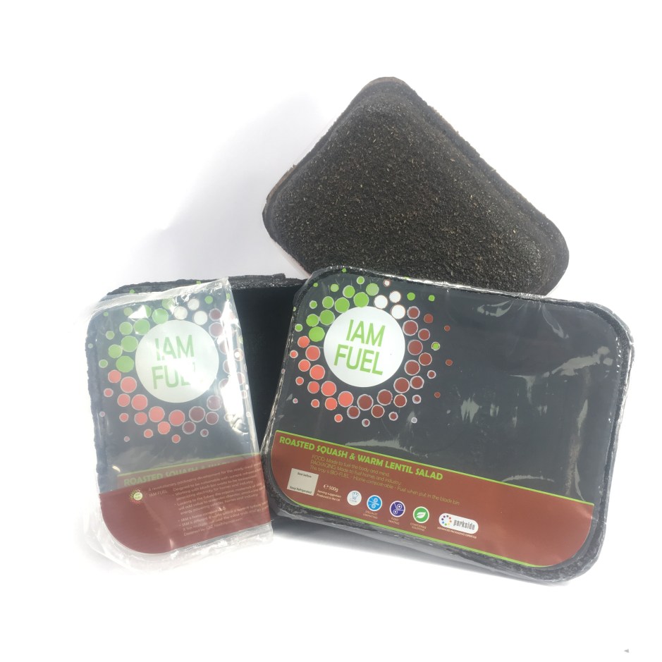
The finished trays – Double sided print
The image below shows a typo, fortunately I asked my friends through sharing a jpg and instregram to check the look of the graphics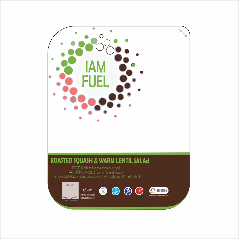
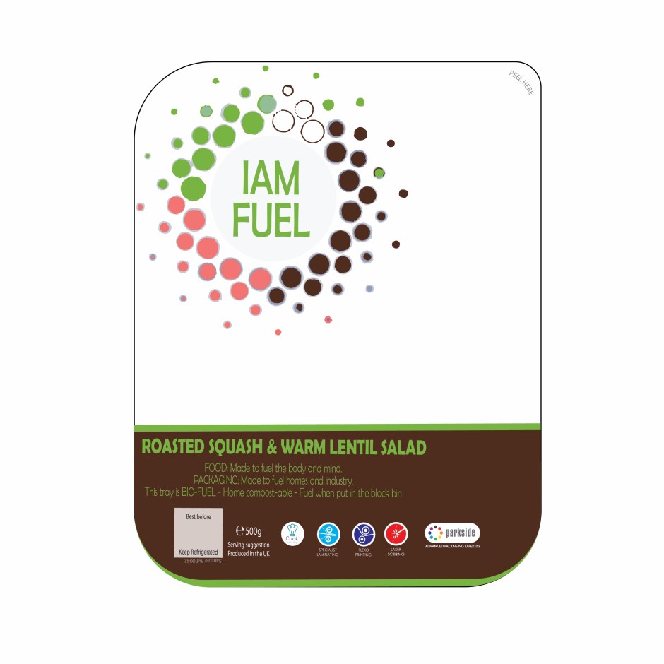
The design below is small dee (d) corrected, also Kirsty change the red logo for compostable. Thank Kirsty.
 feet1st