
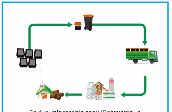
Communicating what to do with the packaging
We as consumers are trained to look at packaging and dispose/ sort the packaging according to labels.
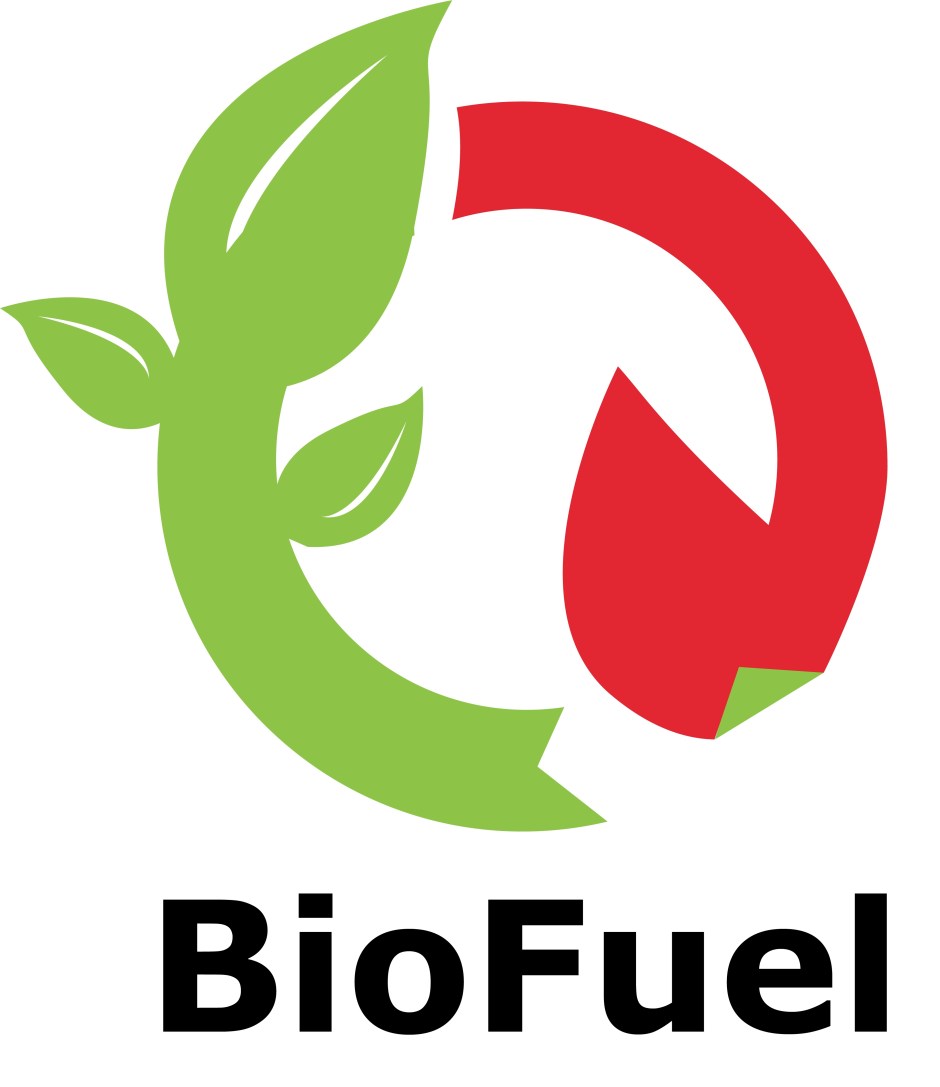
I wanted to design an info graphic that said
Renewable source
Sustainable
Burn as fuel
I used the colour green as this colour is generally recognised as a good – sustainable choice.
The circle is to communicate renewable
The colour red and upward pointing flame is communicating burn.
I was happy with this graphic, I used my instergram following to track if the infogaphic was liked by others,
These where other development sketches

I chose to go with the red and green as the info graphic also worked well when lazer etched and molded directy on to the tray.
 feet1st